
The document everything else was built on
Headland was a piece of approved land with no name and no identity. This book is what was decided before anything was made, and it is the reason the website, the memorandum, the twelve lot briefs and the campaign all sound like one place.
Anyone producing Headland work. The agency, the agents, a photographer, a printer, a developer, the next person to open the file. It exists so nobody has to be briefed twice.
Sections one and two are why the brand exists and who it speaks to. Everything after that is the consequence. Read them in order and the rules stop feeling arbitrary.
The book obeys itself. The colour pages sit in the palette. The type pages carry the scale in their own headings. The photography page is illustrated by photographs that obey the photography law. A page that breaks its own rule is wrong by definition.
Values are taken from the live system at headland-website/src/styles/tokens.css, not from the original aspiration. Where a rule and the shipped code once disagreed, the code won and the rule was corrected here.
Why the brand exists
The business problem. The consumer problem. The insight. The proposition and the commitment matrix.
The offer and the buyer
The estate. The twelve. The place. Who buys, what the evidence says, and what it refuted.
The voice
The master line. Five principles. Mechanics. Approved language, banned language, one voice in public.
The marks
Wordmark. Lockups. Five tiers. The Approval Seal. The contour, the coordinates, the outline.
Colour and type
Six colours and two scoped palettes. Three typefaces. The scale, the core styles, the hierarchy.
Layout and motion
Space, measure and surfaces. The motion law. The responsive lesson, which cost the most to learn.
In application
Photography, renders, lot plates, status, the surfaces, social, advertising, film, the artefacts.
Library and open locks
Where every file lives, and the short list of things still unresolved.
Why the
brand exists

Twelve lots, and no way to be found
Without a funnel the website is a brochure waiting to be discovered. With one it is a working sales channel. The brand was built to do the second job.
Twelve individually titled homesites on one headland, under a single development approval. Four priced and offered to market. Eight held.
Turn qualified document downloads into serious enquiries, serious enquiries into first inspections, and first inspections into contracts on the priced lots.
Not an awareness campaign. Awareness is not the problem. A measurable pipeline that ends in an inspection is the problem, and every brand decision in this book was made against it.
Source: Advertising Brief v1 §2, 27 June 2026. The numbers behind the task set live in the campaign record, not in this book. This is the foundation, not the scoreboard.
Two options and a gap
This buyer has thought about a coastal move for years. They have watched projects derail at the approval stage. They have stopped looking, because looking itself stopped feeling productive.
Generic coastal estates
Approved, and without character. Project-built homes, body corporate, no privacy. It solves the risk and loses the reason.
Existing beachfront
Rare, often dated, and locked to somebody else's design choices. It solves the position and inherits the compromise.
Approved land to design on
Coastal land they can build their own home on, with privacy, already cleared and already approved. Almost no inventory of this type exists. Headland is the gap.
The friction is not price. The friction is the absence of a credible offer that removes the planning gamble.
The thing this buyer fears most is not price. It is spending two years and seven figures discovering they cannot build what they wanted, because the approval does not allow it.
The obvious insight is that coastal land is scarce. True, generic, and claimed by every developer. The sharper one is that the fear is operational rather than philosophical. They are not afraid of missing a lifestyle. They are afraid of the project failing.
The lifestyle is the reward. The de-risking is the gateway.
Visualisation closes the imagination gap
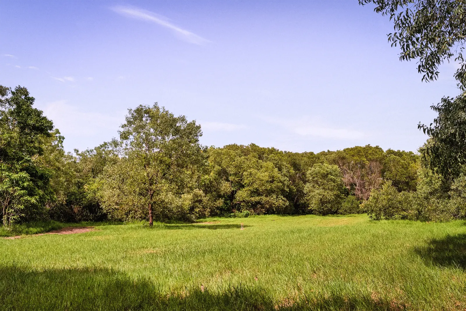
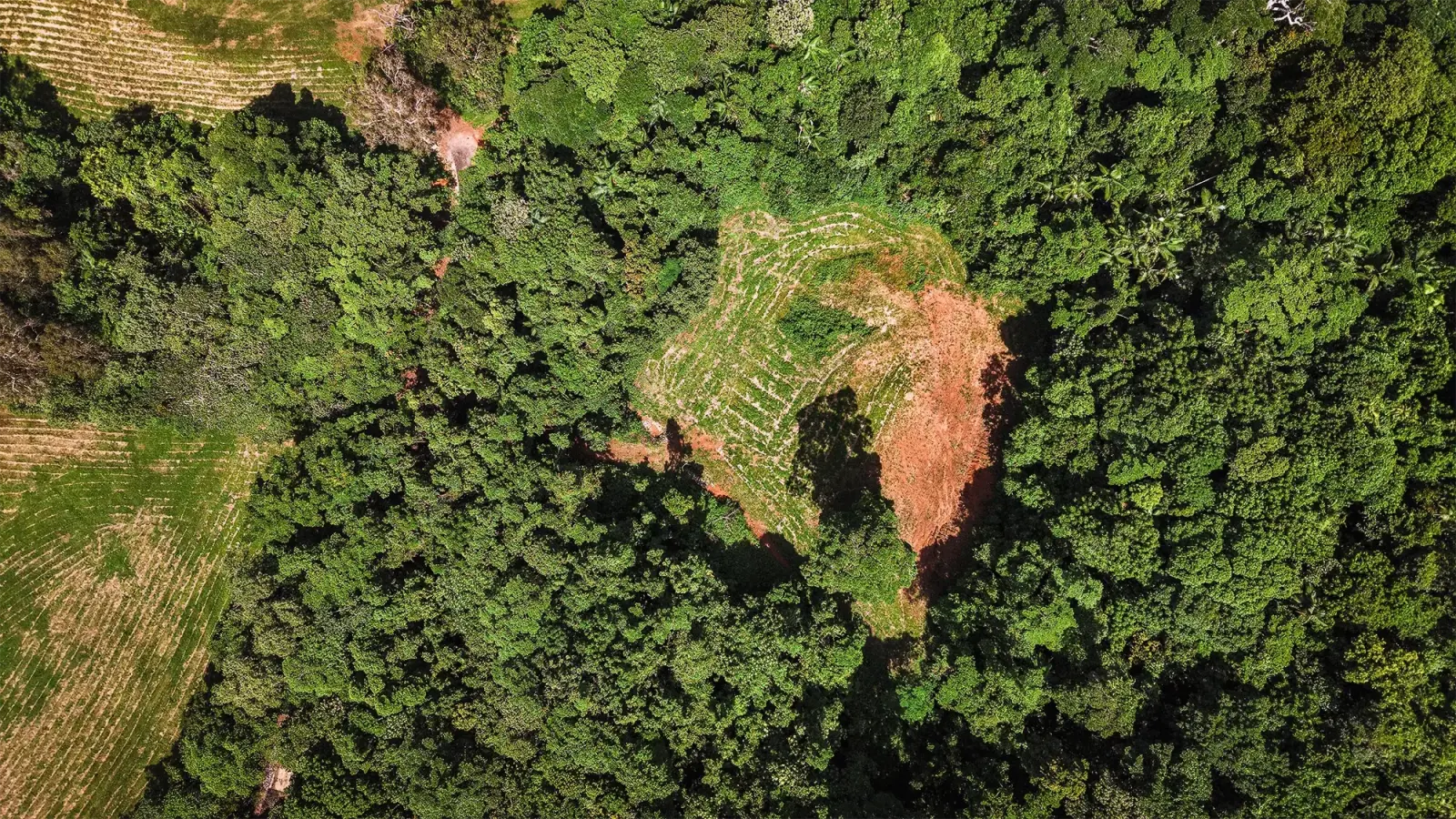
Buyers struggle to imagine the unbuilt. Vacant land shown with a credible picture of what could stand on it draws more interest than the same land shown bare. The renders are a conversion mechanism, not decoration.
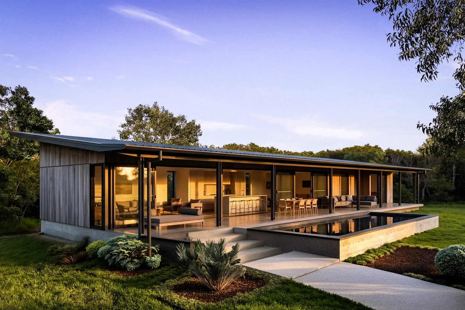
The brand is architect-credit-free, not architect-aesthetic-free. No architect is named in customer-facing copy, and the register is held deliberately across every render: single-storey pavilion, deep eaves, weathered grey-brown timber, warm grey stone, bronze glass, dark standing-seam roof. The buyer is shown what is possible on the pad, never who would deliver it, because they choose that themselves.
Every render carries the label INDICATIVE · AI VISUALISATION. Not sometimes. The labelling discipline is what protects the trust the rest of the register builds.
Above: the cleared pad on Lot 18. Below: the same pad, visualised.
What the brand was built to achieve
Recorded as set at the outset, so anyone reading later knows what the work was aiming at rather than guessing from what it became.
| Primary conversion | Qualified requests for the Information Memorandum, captured on the site, delivered by email. |
|---|---|
| Downstream | Serious enquiries progressing to first inspections on the priced lots. |
| Commercial | Contracts on the lots offered to market with prices. |
| Governing metric | Cost per intent lead, read against the plan rather than against the sector. |
| Explicitly not | Reach, impressions, followers, or awareness of any kind as a headline measure. |
No cost-per-lead figure is promised anywhere in this book or in any Headland document. The research found no verified buyer-side benchmark for Australian land at this price. See the refuted page in section two.
The proposition
Headland is the only private estate of approved, council-cleared coastal homesites in Mission Beach, for Australians who want the freedom to build their own coastal home on titled land without rolling the planning dice, in an era of tightening coastal approvals and disappearing private beachfront.
A private estate of approved, council-cleared coastal homesites.
Council-approved, pads physically cleared, titled, ready to build.
Australians who want the freedom to build their own coastal home.
Tam O'Shanter Point, South Mission Beach, Far North Queensland.
They do not want to roll the planning dice on coastal land.
Tightening coastal approvals, disappearing private beachfront.
Single, true, and a springboard. Every public line in this book is a translation of it. If a new content pillar cannot be traced back to one of the six fields, the pillar has drifted.
What we commit, what they want
| The company side | The customer side | |
|---|---|---|
| WHO | Purpose. To offer the freedom to build a private home on coastal land that already has every clearance in place. | Identity. Australians building their own life on real estate that lasts. Not investors. Not deal seekers. People designing a future they intend to live in. |
| WHAT | Onlyness. The only private estate of approved, council-cleared coastal homesites in Mission Beach. | Aims. Build the home they want without the approval gamble. Own the position. Slow down. Hold a place as legacy rather than yield. |
| HOW | Values. Editorial restraint. Fact-led scarcity. Quiet specificity. No claim the documents do not back. Architect-credit-free, with the aesthetic register held deliberately. | Mores. Read carefully. Distrust marketing language. Want documents, evidence and time. Do not respond to urgency. Do respond to a credible picture of what could be built. |
Most work speaks only to the left column. The matrix forces the second question on every asset: does this also speak to the identity, the aims or the mores? The strongest work speaks to both columns at once.
Run the rows across. If they do not line up, the brand is broken.
Headland exists to give freedom to people building their own life. The buyer is the kind of person who is building their own life. The purpose names what the brand makes possible, the identity names who is looking for it. Same direction.
The onlyness is approved and council-cleared. The aim is to build without the approval gamble. The onlyness removes precisely the friction the aim is trying to avoid. This is the sharpest row in the matrix, and the reason the brand works.
The buyer distrusts urgency, so the brand refuses urgency. The buyer wants documents, so the brand leads with documents. The buyer reads carefully, so the brand is built to be read carefully. This row is the register lock.
Use the bottom row as the litmus on any line of copy. Does this sound like marketing language the buyer would distrust? Does it use urgency? Is there an unlabelled render? Failing the mores test is failing the brand.
One proposition, three lenses
Not competing ideas. The same proposition, sharpened for where the reader is standing.
Approval is the asset
The most valuable thing here is the document council issued. Lead with it. The Seal at the top, the fact stated, the land shown, the invitation quiet. Reads like an annotated document rather than a post, which is what stops the scroll in this category.
Twelve. Approved. Yours to design.
Three facts in three beats, for a reader who has already met the brand and needs the reminder rather than the argument. Tight repeatable templates, one-line headlines, the Seal as punctuation.
The site is the document
The editorial bed. Long carousels that read like the front matter of a hardback. Reels that linger on the document rather than the lifestyle. No headline raises its voice. This is the register, not a campaign.
The offer
and the buyer
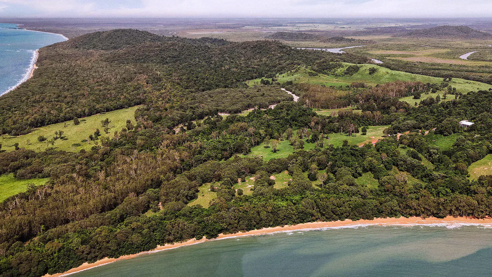
Twelve lots on one headland
| Lots | Twelve, capped at twelve |
|---|---|
| Approval | One D/A · RAL22/0031.01 |
| Authority | Cassowary Coast Regional Council |
| Zoning | Rural residential · community title scheme |
| Shoreline | About 2.4 km, private |
| Place | Tam O'Shanter Point, South Mission Beach |
| Coordinates | 17.9700° S · 146.1067° E |
| Title | All twelve titled, ready for sale |
| Services | Power, water and NBN to each block |
Every number in this book comes from the approval, the survey plan or the agents' memorandum. If a figure cannot be traced to one of those three, it does not appear.
The twelve
| Lot | Character | Size | Position | Aspect | Offered |
|---|---|---|---|---|---|
| Rainforest | |||||
| 22 | The Canopy Retreat | 5,819 m² | North · Canopy | N | $700,000 |
| Beachfront | |||||
| 14 | The Reserve Edge | 4,707 m² | North · Nature Reserve | N | Held |
| 15 | The Long Veranda | 5,250 m² | Beachfront · North | E | Held |
| 16 | The Reveal | 4,200 m² | Beachfront · Mid | E | Held |
| 17 | The Wide Frame | 5,454 m² | Beachfront · Mid | E | Held |
| 18 | The Slow Slope | 4,756 m² | Beachfront · Mid | E | $995,000 |
| 19 | The Centre Clearing | 4,805 m² | Mid · Centre Cut | NE | Held |
| 20 | The South Pavilion | 4,662 m² | South Ridge | NE | Held |
| 21 | The Track Cottage | 1,654 m² | South · Beach Access | SE | $950,000 |
| Hectare | |||||
| 23 | The Acreage | 2.53 ha | Inland · Largest | W | Held |
| 24 | The Crown | ≈ 2 ha | South Headland | E | Held |
| 25 | The Country | 2.5 ha | Inland · Rolling Country | W | $1,200,000 |
Three bands, not four. Land-only band roughly $700,000 to $1.2M. Prices live in the Lot Brief and the Information Memorandum, never on the public site. Live availability comes from a status file the agents update, so no page here states a current count.
The approved source bank
Region copy is drawn from these lines only, rephrased in voice. Anything outside them is provisional.
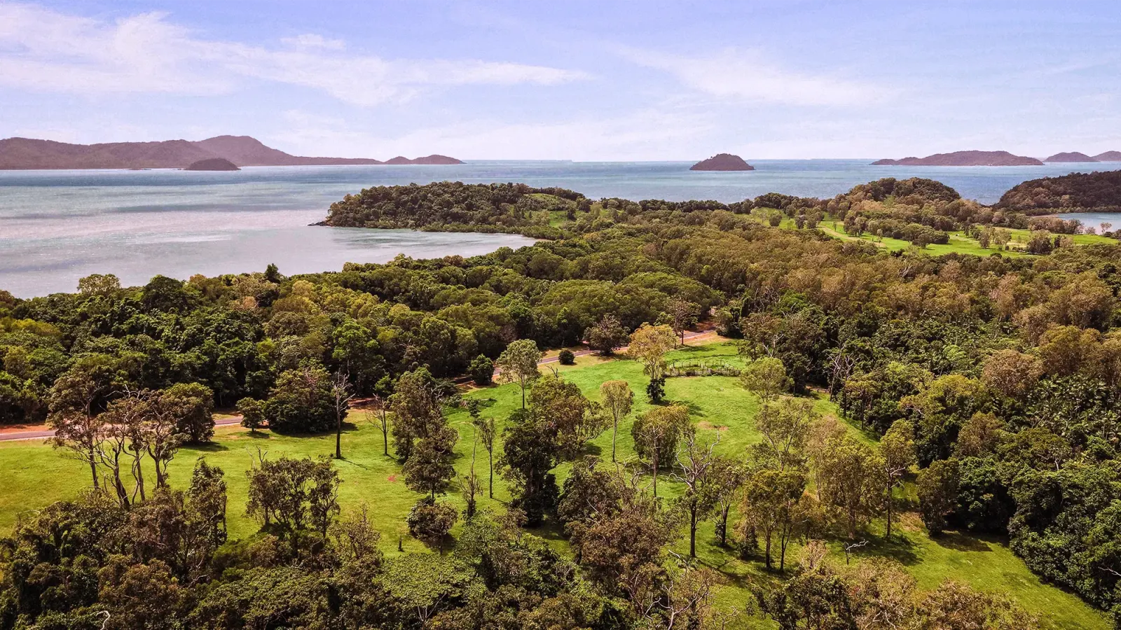
South Mission Beach, on Tam O'Shanter Point, Cassowary Coast, Queensland. Two hours south of Cairns on the Bruce Highway, twenty minutes from the Mission Beach Promenade.
The reef sits under 40 km offshore. The Family Islands are a few kilometres out: Dunk, Bedarra, Kumboola, Thorpe, with Lugger Bay and Kennedy Bay alongside.
Gated, one no-through road, bounded by national park, conservation land and the Coral Sea. Four villages across fourteen kilometres of beach. The locals are never outnumbered by the visitors.
Birthplace of the Great Barrier Reef Marine Park Authority. There is no traffic. Just nature. You slow down for wallabies, not e-bikes.
Who this is written for
Verified research, not assumption. What follows survived a three-vote check. What did not is on the next page.
Australians, 45 to 65, household income above $250,000, already owning property. Capital-city based, with Sydney and Melbourne carrying most of the movement to regional Queensland. Consideration runs six to eighteen months, a partner is involved, sometimes adult children. The decision happens at a kitchen table over months, never in a sales appointment.
Investors chasing yield. Off-plan apartment buyers. First-home buyers. Deal seekers. Excluding them sharpens the response and saves the money.
Lead with place and lifestyle. The move is driven by daily rhythm, not aesthetics or returns. Support with de-risking: approved, titled, cleared, services to the boundary. Support with evidenced scarcity, through facts, never price or urgency. Never an investment frame.
That coastal land with an approval is essentially gone. That if something looks like it works there is probably a catch they have not found. That most developers oversell. That they would rather pay more than fix it later.
Buy it for your future. Because if you go looking for it in ten years, that will not exist.
Tom Quaid, Colliers, 8 May 2026
What the evidence refuted
A book that records what has been disproven stops the next person rediscovering it. Nothing else in the system does this job.
Reclaim your time
The less-commuting, get-your-life-back hook. Refuted on every vote. It reads as a city-worker frame and this buyer is not escaping a commute.
Fear of a better option
The idea that the market moved from fear of missing out to fear of a better option, and the claim that buyers now demand specific due-diligence reports. Both refuted. The long deliberation headline stands. These specifics do not.
Any cost-per-lead benchmark
Every cost and conversion benchmark tested was refuted. One figure survived and it is a vendor-lead instant-form median, a floor rather than a buyer-side number. There is no verified buyer-side benchmark for Australian land at this price. Test it. Never promise it.
Also unevidenced, and therefore open: which targeting actually works, and how far to address climate and insurance in creative without planting the doubt. Both are judgement plus a test, not a known answer.
Three ways in
The site is the conversion hub. Every page either delivers the reader to one of three captures, or moves them deeper so they arrive at one with more conviction.
All three are email-gated and all three email the agents. A person reads every one. A person replies, within two days. That promise is on the site, so it is a commitment rather than a line.
Notify me
Soft intent. Email plus event preferences. Trigger-based, no schedule, no cadence promised.
Send me a document
The working capture. Three magnets: the Information Memorandum, the flagship; the twelve Lot Briefs, one per lot, six pages each; the Approval Pack. The document lands in the inbox within minutes.
Talk to Tom
Name, email, phone, lot of interest, what to discuss. The heaviest intent signal, and the one the whole funnel is pointed at.
After a document request, a short welcome sequence follows: the document recap, then the approval explained, then the agents and the inspection. Nurture is paced to a long deliberation, not to a close.
The voice

The freedom to build however you please.
Cleared by Council. Designed by you.
Cleared is deliberate. Council cleared the planning, and the building pads are physically cleared on every lot. Both readings are true, and every aerial proves the second while the sub names the first.
What is kept, what is retired
Home hero with the sub overlaid. Lot page headline strip, master only. Lot Brief cover. The Approval page lower band. Information Memorandum cover. Social tiles, master only. Cold ad creative.
Not inside body copy, it is a headline rather than a sentence. Not on The Twelve or The Place, which carry their own locked headlines.
Approval that makes you look.
Was the master line. Demoted on 26 June 2026 after the client's reservations about it in that role. It is not dead. It remains available as an optional social hook and campaign line. It is simply not the hero, and the freedom line is.
Build what cannot be built again.
Council will not approve another.
Both use absolute language and both were dropped at the 28 May meeting. Internal documents may reference them as history. No customer surface may carry them.
A knowledgeable local who states the facts and lets you draw your own conclusion
Quiet, specific, unhurried, certain. It never sells. It lays the evidence down and steps back.
Factual
State what is true. Council approved the estate. Not an incredible approved opportunity.
Specific
Detail carries the feeling. A number or a named thing beats stunning every time.
Restrained
Confidence needs no volume. The reader feels the rarity because the facts imply it, never because we said rare.
Certain
Short declaratives, often past tense for the approval. The brand is sure of itself, so it does not oversell.
Warm
Lifestyle lands through concrete, slightly wry detail. Human, never gushing, never sentimental.
The core move: lay the fact, let them conclude. Twelve. One approval. Four offered now, each with a price. The buyer thinks rare and ready on their own.
How it is written
Short and declarative. Break a long sentence into two. Periods do the work commas would.
No em dashes. No ellipses. No exclamation marks, unless genuinely earned, which is almost never. Commas, colons, full stops, the occasional parenthesis.
Spell small counts in the editorial register: twelve lots. Use figures for measurements, distances, areas and prices: 4,756 m², $995,000, 90 minutes.
South Mission Beach. Tam O'Shanter Point. Cassowary Coast. The Family Islands. The Bay. Get them right, every time.
Stated plainly. No euphemism, no from. Lot 18, $995,000.
The wordmark is lowercase. MISSION BEACH is the tracked sub-lockup. Mono labels are uppercase: LOT 22, OPEN, BEACHFRONT. Sentence case in prose.
Balance display copy, tidy body copy, and bind short function words with a non-breaking space so no heading ends on a stranded word. Enforced at build, not left to eye.
The voice does not change. The register flexes.
| Context | Register | How it feels |
|---|---|---|
| Headline or ad | Most distilled | Cormorant, one true line. The freedom to build however you please. |
| Body or caption | Editorial | Short declaratives, specifics, one idea, then stop. |
| Comment reply | Warm, brief | A knowledgeable neighbour answering across the fence. Helpful, unhurried, points to the next step without pushing. |
| Direct message | Warm, personal | As above, a touch more conversational. Offer the agent or the document. |
| Considered, signed | A person reads every one. A person replies, within two days. |
Topics we do not lead with, and answer plainly only when asked: cyclones, flooding and elevation, construction method, the neighbouring development, and the separate Lot 13 workstream. Positions we never take: investment product, holiday rental, flip play, tax-driven purchase.
Sentences we already own
Reuse and rephrase from these. They are approved, traced, and doing work already.
Twelve lots. Two and a half kilometres of beach.
Nestled in a private bay in idyllic South Mission Beach.
Accessed from a single no-through road. There is no traffic. Just nature.
Designed to offer privacy, position, and an address to treasure for the future.
A discrete community title scheme. Protective covenants, without a heavy hand.
All lots are now titled and ready for immediate sale.
Sources: the parent listing text, the client's video transcript, and the 8 and 28 May meeting takeouts. Anything outside those three is provisional and must be locked into Copy Provenance before it goes live.
Words, marks, topics, frames
Hard rules. They govern every surface, including ads and social, and they do not relax under compression.
Stunning · Paradise · Slice of paradise · Once-in-a-lifetime · Location of a lifetime · Don't miss out · Act now · Must be seen · Rare today gone tomorrow · Beachfront opportunity · Dive into · Dream home · Resort-style living · Luxury · Premium · Affluence · Excellence · Cannot · Never · Won't approve
Luxury and premium are acceptable internally. Never to a customer.
Em dashes · Ellipses · Exclamation marks, unless genuinely earned
No architect attribution · No build-style or designed-homes claim · No unlabelled render · No new headline copy before it is locked into Copy Provenance
Cyclones · Flooding and elevation · Construction method · The neighbouring development · Lot 13 pricing
Answer plainly if asked, then move on. Never lead.
Investment opportunity · Capital growth · Yield · Portfolio · Tax haven · Investment product · Portfolio builder · Holiday rental · Flip play · Tax-driven purchase
One measured holding note is permitted in the Information Memorandum only. Never the website, never an ad.
One voice in public
Sound like one informed local human, never a marketer and never a bot. Answer the actual question first, plainly. Then, if it is natural, offer the next step. Then stop.
Four of the twelve are open right now. Lots 18, 21, 22 and 25. The others are held. Happy to send the detail on any of them.
Not: Yes, be quick, these won't last, DM us now.
It is cleared, titled and council-approved land on a private headland with beach frontage. Twelve homesites, most over an acre. Tom can talk you through what sits behind the number if it helps.
Not: you get what you pay for.
Most buyers here are building a home to live in, or holding for the future. We keep the detail lifestyle-led. The Information Memorandum lays out the place and the lots if you would like it.
Not: strong capital growth and rental yield.
Golden order, every reply: answer the question, use a concrete fact, one soft next step only if it is natural, stop. Usually one to three sentences. Escalate to the agents for anything legal, contractual, financial, negotiable, about a held lot, or anything you are not certain is true.
01
Any banned word. Stunning, premium, investment, act now. Cut it.
02
Any em dash, ellipsis or exclamation mark. Remove it.
03
Did I claim rarity, or show it with a fact. Show it.
04
Would a calm, informed local say this, or a marketer. Make it the local.
05
Did I answer the actual question before offering anything.
The marks

Lowercase Cormorant Garamond in Estate Green, closed with a full stop. The reflected L carries the headland's silhouette. The lowercase shape is the recognition mark, which is why it is never set in caps and never stylised.
Neutral. Never letter-space the wordmark. One weight, one colour. On paper it sits in Estate Green, on a dark field in Sand, and never in Ochre.
100px on screen, 25mm in print. No outline, no shadow, no second colour, no container.
MISSION BEACH tracked at 0.42em beneath the wordmark. It is part of the logo, not a tagline. Do not drop it from the default lockup.
The subtitle never exceeds 14% of the wordmark cap height, and centres to the wordmark.
Baseline to subtitle cap line, roughly half the wordmark x-height. Hold it across every size.

Enquiry documentation cover and footer, contract title page, The Approval page, and press where the regulatory weight is the point.
Roundel left of the wordmark at small scale, right of it at large scale. Ochre or Estate on light grounds, Paper on dark.
The Seal accompanies the wordmark. It never replaces it, and it never carries a year.
One tier per touchpoint
Wordmark alone
The site header, captions, and anywhere the mark stands beside the two agency wordmarks. The one place the sub-lockup may be absent.
Wordmark and place
The default. Hero compositions, covers, print title pages, gate signage, the office sign.
Wordmark and Seal
Enquiry cover and footer, contract title page, The Approval page, regulatory press.
Full hero
Lockup centred, Seal as a corner mark, bottom right by default. Rare, and always with significant whitespace.
Roundel alone
The certification moment, a watermark on legal pages, a foil stamp on heavy stock.
Never combine the contour with the wordmark in one lockup. The contour is decoration and the wordmark is signature, and merging them makes the second look like the first.
The mark at its smallest

17.9700° S · 146.1067° E
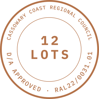
The document, made a mark
The proof mark. It is the visual translation of the de-risk claim, and it is the one thing on any surface that says this is real.
| Top arc | Cassowary Coast Regional Council |
|---|---|
| Bottom arc | D/A approved · RAL22/0031.01 |
| Centre | 12 LOTS |
| Colourways | Ochre · Estate · Paper |
| Print minimum | 40mm diameter |
| Screen minimum | 120px, below which the arc type fails |
No year on the arc. The approval reference traces to the legal record and does not date the property, which matters because the Seal travels across surfaces that outlive the campaign. Wherever it appears it links to The Approval. It earns its place on anything doing conversion work and stays off anything doing place-and-brand work.
Four grounds, one mark

On a dark photograph the Seal keeps its Ochre and sits on a circular knockout of Paper, so the arc type stays readable. It is never tinted to match an image.
Decoration, not signature

The surveyor's silhouette of Tam O'Shanter Point. Single stroke, solid, never broken. Favicon, section dividers, letterhead band.
17.9700° S
146.1067° E
IBM Plex Mono tracked at 0.05em, with mid-dot separators in the survey register. Lot pages, social tiles, document footers.
A 1.2px Ochre hairline over the boundary, with a dark halo beneath so it holds over canopy. It replaced the inherited blue polygon. The italic Cormorant plate number floats beside it, never inside a box and never on a pin.
Colour
and type
Six colours, and two quiet steps
Do not introduce a seventh hue without sign-off. No gradients, no shadows, no glow, no metallics. Hairlines only.
Primary type on light. Dark grounds. The headland in shadow.
The deeper ground for inverted sections and end cards.
Primary light background. Type on dark grounds.
The quiet step, for hairlines and hover grounds.
The bay at low tide. The beachfront category.
Body type and structure.
The accent. The Seal, the lot hairline, the acreage category.
The cleanest off-white. The document itself.
White space is part of the palette. Hairlines are --rule-estate at Estate Green 18% and --rule-ochre at Ochre 40%. This page is set in the palette it specifies.
Two palettes that are not the palette
Both sit outside the six on purpose. Using either one as a general colour breaks the system it was carved out to protect.
Availability has its own palette, deliberately clear of the land and sea hues, because Ochre already means acreage and Coral Sea already means beachfront. If status borrowed either, The Plan would read as one system saying two things.
One second ink, matching the boundary ink on the approved plans. It is scoped to the survey-plate apparatus only: pins, dimensions, the build envelope, footprints, routes and contours. It is not a general colour and it never carries type outside a plate.
Signed off 10 June 2026 with the lot detail spec.
The distinction that matters on a lot plate: the boundary is Ochre at 1.2px, the brand's line. The apparatus around it is Survey ink at 1.4px. Two inks, two jobs, never swapped.
How the colours sit together
The freedom to build however you please.
Body copy sits in Bark on Paper. The default reading ground for the site and for every document.
Cleared, titled, council approved.
Sand carries the quieter passages, and the Seal at its default treatment.
Twelve homesites on a single headland.
Estate Green carries hero moments and section breaks. Type in Sand or Paper, never pure white.
Three, and only three
Cormorant Garamond
A heritage serif the eye has read for four hundred years. Sentence or title case, never caps: the silhouette carries the recognition.
Word shapes the brain processes fast on screen. It carries anything meant to be read rather than registered.
A tracked uppercase device, not a reading face. Use it where a fact is registered. Never set a sentence in it.
The editorial register spells numbers out: twelve lots, THE TWELVE. The metadata register stays numeric: 4,805 m², Lot 22, RAL22/0031.01.
The scale, and how this book uses it
Size from these tokens, never from a bespoke clamp written for the page in front of you. Section six explains what that cost the first time.
| Token | Mobile to desktop | Use |
|---|---|---|
| --fs-hero | 56 → 144 | Hero only |
| --fs-h1 | 40 → 64 | Page headlines |
| --fs-h2 | 28 → 48 | Section headlines |
| --fs-h3 | 22 → 32 | Sub-heads, pull quotes |
| --fs-body-lg | 19 | Lede and intro |
| --fs-body | 16.5 → 17 | Prose |
| --fs-caption | 13 | Captions and notes |
| --fs-mono | 12 | Mono metadata |
| --fs-mono-label | 11 | Tracked labels, eyebrows |
| --fs-mono-fine | 8 | Bottom strips |
This deck has one bespoke number in it: --scale: 1.5. The canvas is 1920 wide and read at arm's length, so every type and space token above is multiplied by that single constant. Nothing else is hand-set.
Under 900px the multiplier drops to 1 and the book runs the tokens at true size. The phone view is not a reduction of this deck, it is the system at native size.
tight 1.05 · snug 1.25 · body 1.6 · loose 1.75
display 0.005em · body 0 · mono 0.05em · label 0.22em · lockup 0.42em
The three that matter
Cormorant Garamond Medium 500
40 to 64px fluid · line-height 1.05
tracking 0.005em · Estate Green
DM Sans Regular 400
16.5 to 17px fluid · line-height 1.6
tracking 0 · Bark
IBM Plex Mono Medium 500
11px uppercase · tracking 0.22em
Sand on Estate Green · height 56px
The specimen beside this page is set in exactly these three declarations, at this deck's one multiplier. Nothing on it is drawn by hand.
The freedom to build however you please.
Twelve homesites on a single headland. Cleared, titled, and council approved. A considered place to build the home you want, your way.
Web and print
| Element | Web | |
|---|---|---|
| Hero | 56 to 144px, line-height 1.05 | Cover only |
| H1 | 40 to 64px, line-height 1.05 | 36 to 48pt |
| H2 | 28 to 48px | 24pt |
| H3 | 22 to 32px | 18pt |
| Lede | 19px, Cormorant italic | 13pt italic |
| Body | 16.5 to 17px, line-height 1.6 | 11pt, leading 14pt |
| Caption | 13px | 9pt |
| Mono metadata | 12px, tracking 0.05em | 8 to 9pt |
| Mono label | 11px, tracking 0.22em | 7pt |
Open tracking on display, neutral on body. No drop shadows, no outlines, and no italic body text except when attributing a source.
Layout
and motion
Eight, and everything on it
An 8px rhythm carries across web, print and social. Margins, gutters, baselines and mark placements are all multiples of it. Ten steps: 4, 8, 12, 16, 24, 32, 48, 64, 96, 128.
Editorial and open. Hairline rules do the dividing. No cards by default, no shadows, no glow, no rounded containers pretending to be paper. If a block needs separating, a 1px rule separates it.
| Container | Value |
|---|---|
| Measure, readable prose | 42rem · about 680px |
| Container | 75rem · 1200px |
| Container wide | 100rem · 1600px |
| Gutter | clamp(1.625rem, 6.5vw, 3.25rem) |
The canvas is 1920 by 1080. The live area is the container-wide token, 1600px, centred, which is what sets the 160px margin on every page you have read so far. Prose is held to the measure. Nothing on any page of this book was positioned by eye.
Fixed canvases at 1080 wide, an 80px live-area margin, six columns at 128px with 32px gutters, and type baselined on the same 8px grid. When two tiles sit side by side in a feed, the eye reads the alignment between them. Same rhythm, so the feed reads as a system.
Considered, never decorative
Two curves, three durations. Elements set and land. Nothing drifts in, nothing bounces, nothing loops.
The default. Leaves quickly, arrives slowly, settles without overshoot.
For states that go both ways. Hovers, toggles, a panel opening and closing. Symmetrical, so the return feels like the same gesture reversed.
Hover, focus, the smallest state change. Fast enough to read as a response, not an animation.
The working duration. Panels, toggles, anything the reader asked for.
Arrivals. A page landing, a boundary drawing itself in. Nobody should sit through the same reveal twice.
The floor is absolute. Honour reduced-motion everywhere. One movement at a time: the image moves, or the type appears, or the camera moves, never two. Never animate away legibility, never block interaction, never re-animate on scroll. Every reveal in this book runs on the curves above, which is why they are shown rather than described.
The lesson that cost the most
This page exists so nobody repeats it. It is the hardest-won knowledge on this brand and it is worth more than any rule about a hairline.
The site was tuned for a wide, high-density 16 inch viewport. On lower-density screens, chiefly Windows laptops running display scaling at 125 to 150%, the same layout read oversized. Not broken. Just too big, everywhere, at once.
Because the type had been sized per page. Roughly fifteen bespoke heading clamps had accumulated across the site. There was no single scale to turn down, so there was no clean global fix to make. The cost of the shortcut arrived long after the shortcut.
A page-level render at 75%, gated to the affected band only: 860 to 1439px wide, and only below 1.9 device pixels per unit. High-density screens are excluded at any width. Above 1440 and below 860 are untouched. Full-height heroes compensate under the same gate.
Size new work from the tokens on the scale page. Never from a clamp written for the page in front of you. A scale you can govern is worth more than a heading that is perfect on one screen. The navigation collapses to a menu button at 859px and below, and the whole system is composed mobile first.
In application
Warm, real light, and the whole fact
Two registers, and both are needed. The aerial establishes the place, the scale and the position: the headland, the beach, the bay, the Family Islands, the lot boundaries. The ground frame proves it: the cleared pad, the peg in the grass, the light through the canopy. The aerial makes them want it. The ground frame makes them believe it.
Golden hour. Documentary realism. One large image per moment rather than a grid of small ones. People used sparingly and never from a stock library, because the buyer is 55 and knows what 25 looks like.
Forbidden · drone spectacle for its own sake · stock palms · generated people · flare overlays · tourist-board cliché · anything graded blue
Renders, and the label that travels with them
Every visualisation carries INDICATIVE · AI VISUALISATION, placed so the eye reaches it after the image and before the wordmark. On a render tile that is the bottom right of the paper bar. No render ships without it, in any format, at any size.
Single-storey pavilion or cluster, never a vertical block. Low-pitched standing-seam roof in dark grey with deep eaves. Vertically oriented weathered grey-brown hardwood. Split-face warm grey stone base. Floor-to-ceiling glass, slight bronze tint. Mature retained natives, not lawn. No white, no black, no bright colour.
16:9 for the hero. 4:5 and 9:16 generated as separate renders, never cropped from the hero. The estate grade is applied after generation so all twelve read as one place rather than twelve commissions.
The disclaimer line on a lot study reads: one possible future, indicative only.
 Indicative · AI Visualisation
 22
Lot 22 · of 12
17·9700 S · 146·1067 E
22
Lot 22 · of 12
17·9700 S · 146·1067 E
The boundary, drawn in our hand
Ochre at 1.2px on aerials, Paper on dark obliques, with a dark halo beneath so it holds over canopy. Hand-drawn weight, never CAD-perfect, so it reads as the same hand that drew the contour.
Everything that is not the boundary sits in Survey ink at 1.4px: pins at each vertex, edge lengths, the build envelope at 8% fill, walk paths dashed. Labels in mono, never longer than three words.
Italic Cormorant floating beside the outline, never inside a box and never on a pin. The boundary draws itself in once, over 1.4s, then settles and stops. No loop, no re-animation on scroll, no rotation, no virtual tour.
Every boundary is traced from the approved plan and stored as coordinates, as fractions of the frame, so the line is redrawn at any crop and never baked into an image. The plate here is the real trace for Lot 22, drawn live by this page.
Status is metadata, not a marketing claim
The board is the urgency. Nobody has to be told to hurry when they can see how much is left.
Available for enquiry. Mono caps in the availability green. On The Plan the lot fills at 18% with a 1.2px outline.
Contract issued, not yet settled. Goldenrod, deliberately clear of the Ochre that already means acreage.
Settled. Bark at 52%, muted. Sold lots fade rather than shout, and stay readable and clickable.
The agents push changes, a small JSON file on the site carries them, and the page reads it on load. No badges, no red, no flashing, no countdown. When the board shows fewer open lots next month, the message intensifies on its own. That is scarcity through evidence rather than exhortation, and it is the whole reason the mechanism exists.
The site is one document, read in order
Setting, then proof, then imagination, then the map, then the conversation. The order is the argument.
The Place
The setting. Where it is, what surrounds it, what a day there is like. Nestled in a private bay in idyllic South Mission Beach.
The Approval
The proof. An approval the headland earned. The reference, the authority, the spec block. The one page the whole brand rests on.
The Twelve
The imagination. Twelve cards, cleared and imagined, each with its own locked headline and its own character.
The Plan
The map. The surveyed plan, the live board, the inventory. No filters, no sorting, no compare tool. The brand reads a document, it does not shop.
Enquire
The conversation. Three tiers, one of them featured, the agents named and reachable.
Plus the home page and twelve lot pages, each carrying the same twelve-element anatomy. The editorial scaffolding, volume and section and plate, recurs in the header strip of every page, because the framing device only works if it never breaks. Links are trailing-slash-free, and every paid destination uses the canonical form so a click lands without a redirect.
Social, as a system rather than a set of posts
Approved and ready is the how. The freedom to build is the who. The place is the where. Evidenced scarcity is the when. If a new pillar cannot be traced to a field, it has drifted off strategy.
Place, full-bleed photographic, type inside the live area. Voice, a Cormorant line on paper. Proof, the Seal at the top third with one fact beneath. Render, image over a paper bar carrying the label. Lot spec, the priced card with its status dot.
The Approval Seal, the editorial register, and the visualisation. Everything else supports one of the three.
| Format | Canvas |
|---|---|
| Feed, portrait · the default unit | 1080 × 1350 |
| Feed, square | 1080 × 1080 |
| Carousel slide | 1080 × 1350 |
| Story and Reel cover | 1080 × 1920 |
| Link share card | 1200 × 630 |
| Live area margin | 80px, 240px top and bottom on 9:16 |
| Grid | Six columns · 128px · 32px gutter |
| Wordmark | 200 to 280px |
| Seal, as hero | 240 to 320px |
| Seal, as sign-off | 120 to 160px |
Two type sizes maximum, the wordmark excluded. Every baseline on the 8px grid. Cormorant in sentence case, mono in caps, never mixed. Marks within their size bands and inside the live area. The colour pairing taken from the grounds page. And the copy is ban-compliant, with every render labelled.
The bans do not relax under compression
A short format is exactly where a brand starts breaking its own rules. These are checked before publication, not after.
The Approval Seal, except where the marks section permits its absence. It is the signature.
The wordmark, placed per the tier rules, and the master line or its sub on every cold creative. Retargeting may use either, or the retained hook.
The call to action worded exactly as locked. Not paraphrased, not shortened, not improved.
Every render labelled, with no exception for a small format, and a banned-vocabulary pass before anything is published.
Cleared by Council. Designed by you.
Twelve homesites. One approval. RAL22/0031.01.
Two and a half kilometres of beach. No through traffic. Just wallabies.
The freedom to build however you please.
The document is the place.
Don't miss out on this once-in-a-lifetime opportunity.
Investors take note.
Tropical paradise awaits.
Limited release. Act fast.
Where dreams meet reality.
Pixel and conversion events on every funnel page, tagged destinations on every paid asset, canonical no-slash URLs so a click lands without a hop and logs the right page.
One grade, across everything
One look, on every photograph and every frame. It is what makes the brand read as a place rather than a portfolio.
| Parameter | Direction |
|---|---|
| White balance | 5500 to 5800K. Warm, not pushed. |
| Tint | +2 to +4 magenta, against the green |
| Highlights | Soft roll-off. No clipping in sky or sand. |
| Shadows | Lifted 15 to 20, true black held at the deepest point |
| Mid-tone contrast | Down 5 to 10%. Documentary, not punchy. |
| Saturation | Down 5 to 10%, greens knocked back hardest |
| Greens and cyans | Greens rotated 2 to 4° toward yellow. Cyans down 10 to 15%: the sea is Coral Sea, not turquoise. |
Ninety seconds. Canopy at first light, the walk through the reserve, the islands in one wide take, then the moment the council site plan crossfades into the actual aerial and the document becomes the place. Closes on the bay, then the master line over one still.
Real ambient field recordings. No music bed, no voiceover. Sound-off-first is not negotiable: the type carries the meaning, the sound is the bonus.
60 seconds muted for the web hero, 30 vertical for social, 15 for stories with captions burned in, 6 for pre-roll. All from one master, one grade, one audio bed.
Orange and teal blockbuster grades. Aegean blue presets. High-contrast social presets. Crushed blacks. Magenta in the highlights.
The artefact family
Everything the brand produces as an object. Same marks, same grade, same voice, which is what makes the set read as one estate.
The Information Memorandum
The whole picture, emailed within minutes of the request. The place, the approval, the twelve, the plan, the sale process. The only surface permitted a measured holding note.
The Lot Brief
Six pages, one per lot. Cover, hero photograph, facts and dimensions, build envelope, walk timer, approval snippet. The answer to tell me about Lot 22, in two minutes.
The Approval Pack
The approval itself, as a document. The lightest gate and the heaviest evidence.
The Walk Map
The estate on foot. Distances, the track to the bay, the timings that make the position real.
The Letter
A note from the owner, for the highest-intent moment. The one place the register becomes first person.
The Field Note
The newsletter template. One letter a month, worth opening. Never a schedule.
The Provenance Pack
How the place came to be, for the buyer who wants the whole record.
The printed book
148 × 210mm, 64pp, Smyth-sewn, foil-stamped, hand-delivered. A sales artefact. Never merge its contents with this one.
The freedom to build however you please.
Cleared by Council. Designed by you.
All lots are now titled and ready for immediate sale.
Colliers
Tom Quaid · Associate Director
0400 773 444
Newton Property Group
Kevin Newton · Director
0409 297 151
Tam O'Shanter Point · Cassowary Coast · Queensland
Where things live, and what is unresolved
Marks. Wordmark, stacked lockup, seal lockup and seal, each in Estate Green and Paper, the seal also in Ochre. SVG, PNG and EPS.
Photography, film, lot aerials and plans. In the site asset tree, per lot, with clean and marked variants held separately.
Boundary coordinates. Stored as fractions of the frame, valid only on the exact crop they were traced from. Retrace if the crop changes.
The grade. One custom look file, referenced by every supplier.
Values. The live token file is the source of truth. This book renders it. Where they ever disagree, the token file wins and this book is corrected.
The roundel inside the Tier 3 lockup still carries the superseded dated arc. Redraw it to match the standalone Seal.
The older stamp files on the site carry the same superseded arc. Replace them.
Homesites or lots. Both are in use across the system. Pick one and hold it everywhere.
The renders name no architect, which is correct and deliberate. The aesthetic register on the renders page is described rather than attributed, and it should stay that way on any surface a buyer can reach.
Closed in this edition. The master line, corrected to the freedom line. The flagship document, named the Information Memorandum. The availability palette, corrected to the shipped values. The lot numbers and characters, corrected to the current set. The lot hairline, settled at 1.2px Ochre with Survey ink for the apparatus. The agent's number, corrected.
The freedom to build however you please.
Cleared by Council. Designed by you.